How To Get Noticed In The City
If you've ever ridden a New York City subway, you've seen that there are a lot of people that use these things. It's not hard to see why: they're dirty, hot, jam-packed with pissed off commuters.. wait.. actually it's that they're the only way to get around here that doesn't risk you getting rammed into the guardrails of the BQE.
If you're a person who wants to take advantage of the thousands of people getting on the subway every day across the city, you've got quite the task on your plate. Say you're one of those sad people handing out flyers for your event. With hundreds of stops and millions of people flowing through the city each month, finding the best place to stand to get the most people to take your flyer and throw it in the trash, you're going to have to pick from a huge array of places to stand.
Even worse, if you're trying to get rich New Yorkers to contribute to your cause, you're going to have to figure out which subways they frequent. You'll probably want a way to make them less pissed off too. Lets start by looking at the distribution of subway entrances. For the statistically uninclined, a distribution looks like:
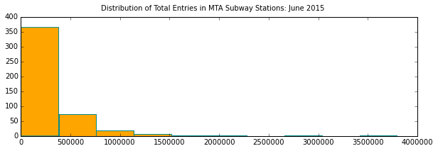
So we see that a few stations see a lot of traffic and many see very little by comparison. What are the busiest ones?
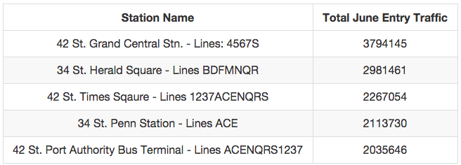
Looks like 42nd Street is the place to be. What about particular times of the day? If you're going to be successful in your campaign, you need to know the exact point in spacetime where you're supposed to be to get the most rich New Yorkers to hand over their money. As it turns out, this was one of the more interesting parts of the investigation.
If you look at MTA's raw data, you'll see something odd - the data is reported roughly every 4 hours in batches. In the aggregate, you get data points from almost every minute of the day, but there are huge clusters that fall at times like 12pm, 4pm, and 8pm since these are the "normal" reporting times for the terminals. Another graphic:
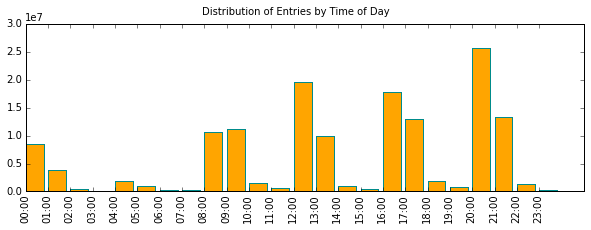
The problem with this view is that these bins don't tell you a whole lot - when you look at the first spike around 8-9am, you're really seeing the number of people who arrived in the 4-hour chunk of time prior to the data being reported. What if you could smooth this out into a more shapely distribution?
It turns out you can: you just to take an average. There are few data points that fall at a time like 2:30am, and lots that fall at the standard times (12am, 4am, 8am, 12pm, 4pm, 8pm) - what if we just took the number of people entering (in total) and divided that by the number of datapoints we have? That would help to eliminate the peaks (and nasty scaling) seen in the above graph!
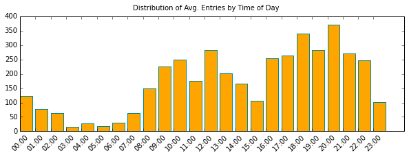
So... If you're harrassing people in a subway station, you want to be there between 8am-3pm and 4pm-12am. That's a pretty broad range, but if you want to only spend a couple hours in a place, this kind of graph will help. If we generate a similar plot for Grand Central Station, we see that there are more people getting on the subway at night:
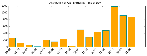
If I had too much time on my hands, I'd do this for every busy station and run with it. But if I wanted to make something that ties all of this back to the original question, I'd do what my friend Yong did. Check out his map of subway stations (the orange bubbles) mapped against median income in 2014 (the darker, the richer). Originally, I stole the map from the US census data archives and he overlayed some geo-coded data to the original product to give you a cool (and interactive) way of looking at our findings for this project:
As it turns out, there's little conflict of interest between finding stations in rich areas and stations with high traffic - at least in New York City they're one in the same. But, as I've hinted at throughout the article, there's probably more to this than just going to the busiest place and handing out flyers - if you've ever walked around in a city, you've noticed that the vast majority of things handed out by strangers end up in the trash bin within a couple seconds of consideration.
If I had a "cause" to campaing for, I'd try something a little more cryptic: people absolutely lose it when they can't figure out what your ad is about and what they hell it's doing in Grand Central Station. Billboards like these:

Should be banned - they're so boring that I practically fall asleep at the wheel. But give me something like:

And I'll search high and low to figure out exactly why blueberries are important, who made the billboard, and everything else about this bizarre creation that there is to know. The bottom line is:

And the other half is having marketing strategies that don't suck. Of course, if you want either, you're going to have to pay me or figure out how to deal with all this data yourself.
